Pinpoint Analytics
The Data Table
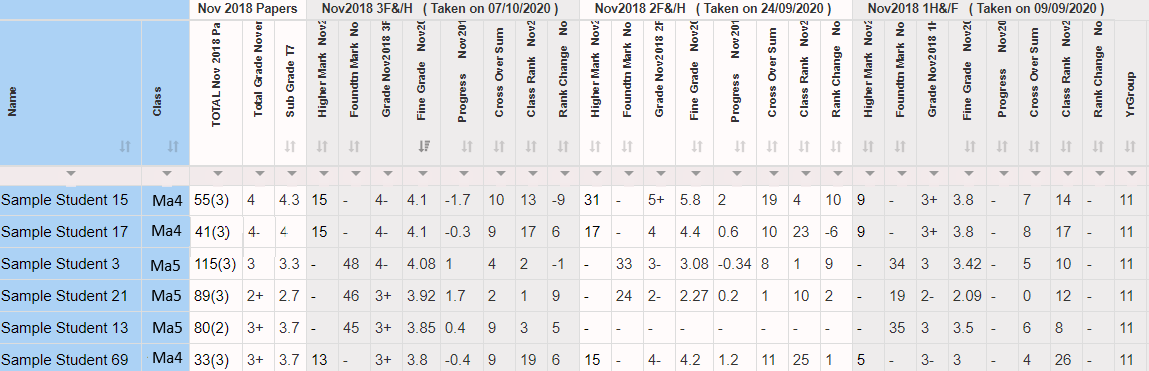
• Give grades for secure mocks & practice papers using estimated GBs ✔
• Rank the year group including higher & foundation students ✔
• Display cross-over marks ✔
• Enter your own grade boundaries ✔
• Determine student progress from one test to the next in grades ✔
• Sort and Filter any columns you wish ✔
• See who has uploaded their QLA marks for all tests ✔
• Export the table to excel ✔
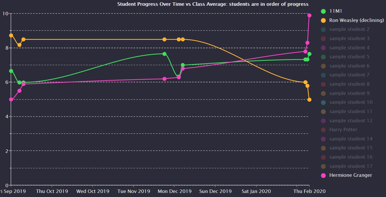
Whole Class Progress Over Time
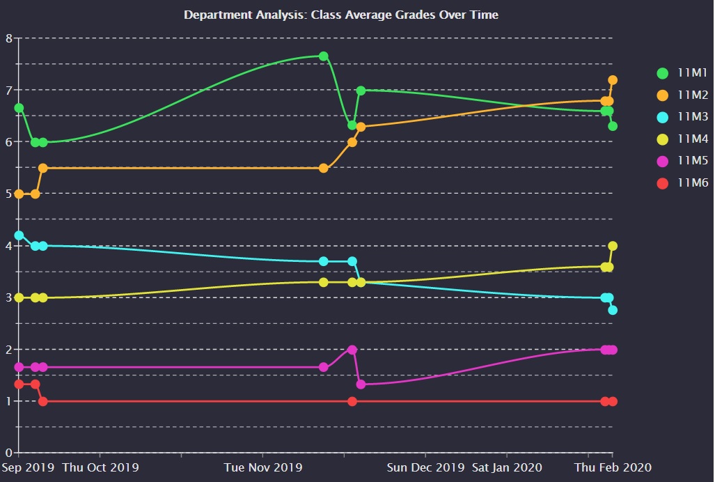
Department Class Progress Over Time
https://www.pinpointlearning.co.uk/mathslead.php
into the URL - this will take you to the HoD area - we will make this a normal button later after getting feedback from HoDs on their department access preferences.
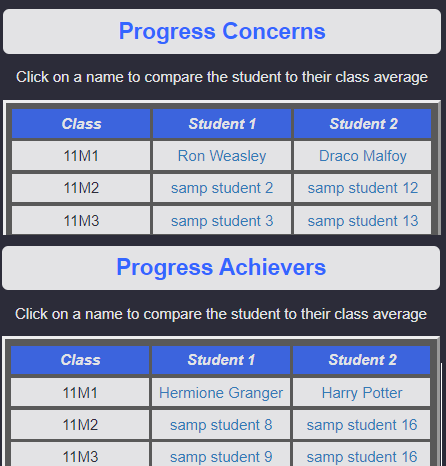
Progress Concerns and Most Improved Dashboard
Our estimated graded boundaries
We have calculated the difficulty (distribution) of each paper using a minimum of 5000 students from pinpoint and adjusted the real grade boundaries of 2018 summer papers based on how hard each paper was. (The hardest ever 9to1 paper according to our data is … 9to1_Edexcel_Secure_Mock_1H !:)) Please note that the estimated grade boundaries and our method is definitely not perfect or exact but should provide a good estimate for you to use with your internal tracking.
You can see the grade boundaries for all individual papers quickly and you can also enter your own grade boundaries for any tests you wish!
As with all the extra features we have ever produced since the beginning this will be at no extra cost. Ok that’s all from me, as ever it would be great to hear your thoughts, ideas and feedback on our latest innovation.
Cheers, Tom Dr Tom Quilter